Reflex Studio
INDUSTRY: Gaming, SFX
SERVICES: Rebranding, Website Design
BRAND TONE: Unity, Modern, High-tech, Innovative
ABOUT THE CLIENT
Reflex Studio has been an established professional audio studio since 1999, doing various audio work for computer games, handhelds, films, and other commercially orientated enterprises. They pride themselves in having experience with making audio with different software and dispersing them across a variety of consoles and devices.
Mission: Select an ineffective website and redesign it in a way that maintains a cohesive and effective design solution that emphasizes the brands mission to attract users and build a sense of trust. This project takes a look at the best practices for web design and applies them to the chosen website to make it more functional and emphasize a positive user experience.
Professional Scoring and SFX for Games and Movies Since 1999.

Before the Redesign


Prior to the redesign, my website lacks any consistency or branding which gains a sense of confusion as the user. It would make potential clients question that they ensure quality work when their website appears to lack any attention to detail or quality. Portraying the work of Reflex Studio in an organized fashion conducts the company as a reputable source for professional scoring and sound effects for games and movies in order to get hired. By implementing a new element that encourages interaction with the user, the website became more engaging and interesting.
Previous User Experience
To uncover the pain points of the user experience, I played the role of the user navigating my current website and marked up areas of concern and confusion. I documented my findings with screenshots and notes, revealing several usability challenges: a lack of informational hierarchy, too many lists of questionable links, and centered text.
There are legibility issues where it is hard to read the content because it is bold, centered, and there are extremely long line lengths that go over the optimal character count. Especially on the home page, the company tries to sell the user with the amount of experience and programs that they have worked with in their career. But by lacking information hierarchy it confuses the reader to understand what information is important when everything is visually deemed as important by the boldness and the font all being the same size. The overall design should lead the users eye to what the company wants to portray as the most important.
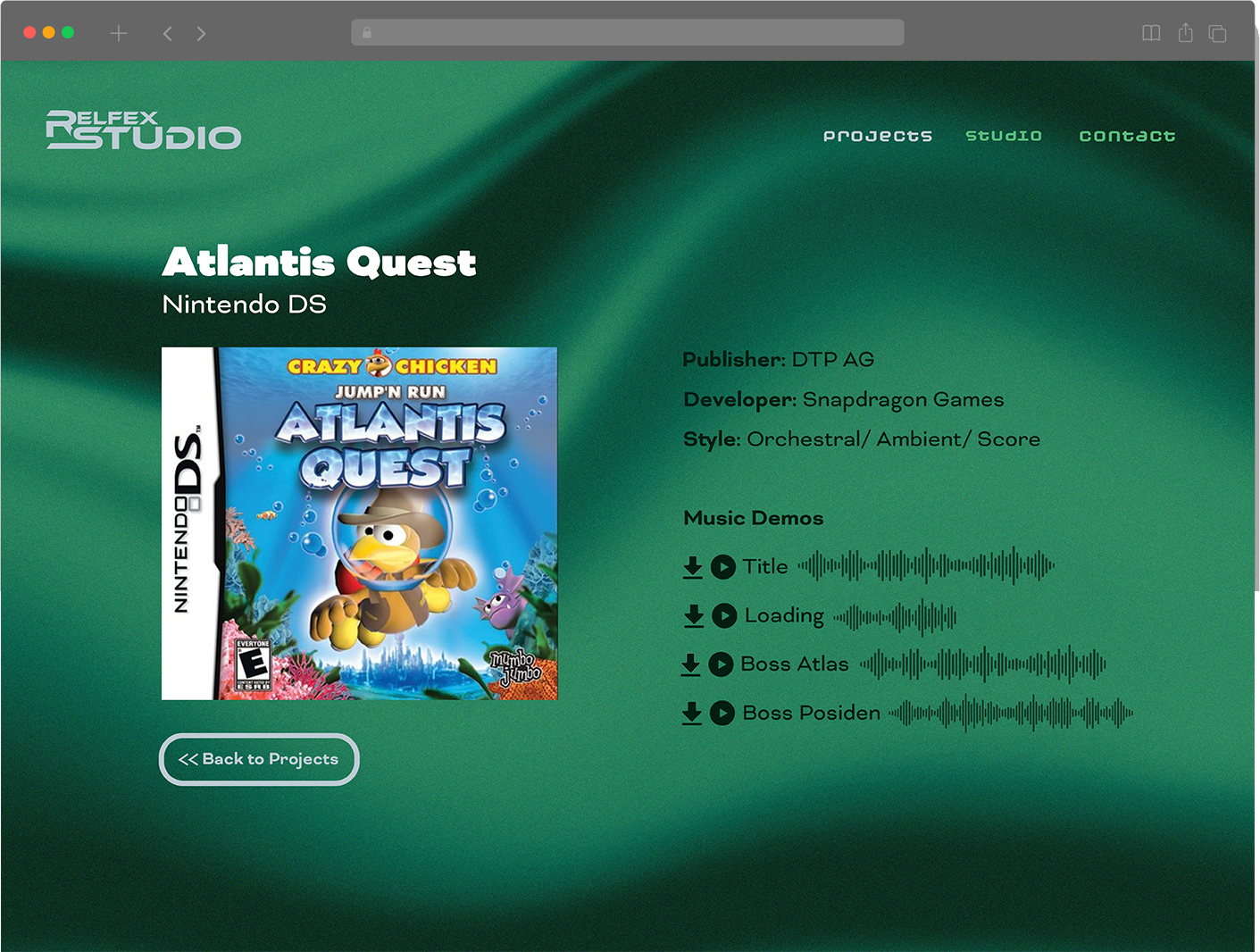
Website Redesign
The new website design and brand identity design for Reflex Studio helps them transform into a reliable and trusted audio and SFX company, generating more work and more interest in the gaming community. With clear hierarchy and an organized layout system, information will be easy to read. Clients are now able to directly communicate to the CEO, Kai Walter, to strengthen the customer service relationship using the newly improved contact page. The visual aesthetics call to the gaming and tech industry with the use of green and blue abstract sound waves, attracting users who love all things video games and audio recording. This website caters to all, but specifically to Gen Z, college students with an interest in game design, and experienced gaming companies. Cleaning up the navigation system allows for users to find familiarity in the layout structure to ease any confusion.

Check out the full user experience: