

Aftershock Festival Campaign
Maintain a cohesive and effective design campaign that harmoniously reflects the passion and energy of Aftershock Music Festival, hosted in the capital of California, to attract new and returning festival goers. This project aimed to create a sense of belonging through the shared love for music fronted by the biggest rock and metal festival on the West Coast with the creation of various print, digital, environmental, and merch deliverables.
Music festivals bring hundreds of thousands of strangers together under the unity of music to contribute to cultural moments. Fans and musicians immerse themselves into something larger than a single-band concert with so many different generations and genres coming together for four nights under the stars of Discovery Park. It’s the great escape from the real world for a weekend where one is transported to an alternate universe filled with their favorite music, whether it’s going to see your favorite artists or being lucky enough to leave with new bands to add to your playlist. Going to see big bands live brings forth an emotional response, for fans it is free therapy and they walk away feeling inspired to live again. One feels fulfilled being surrounded by people just like them with the same interests and matching genuine excitement. It’s the best way to bring people together through peace, kindness, and music.
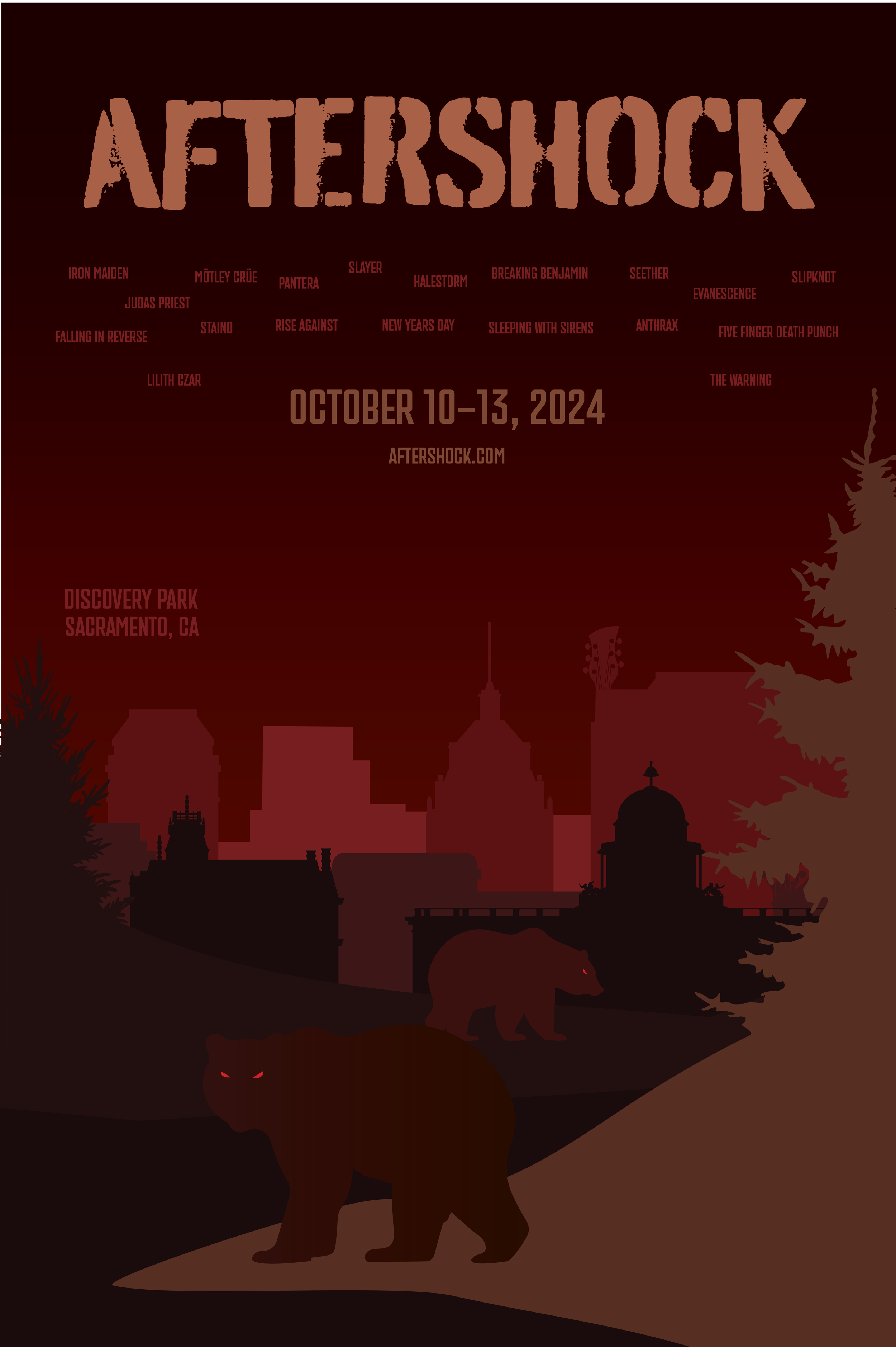
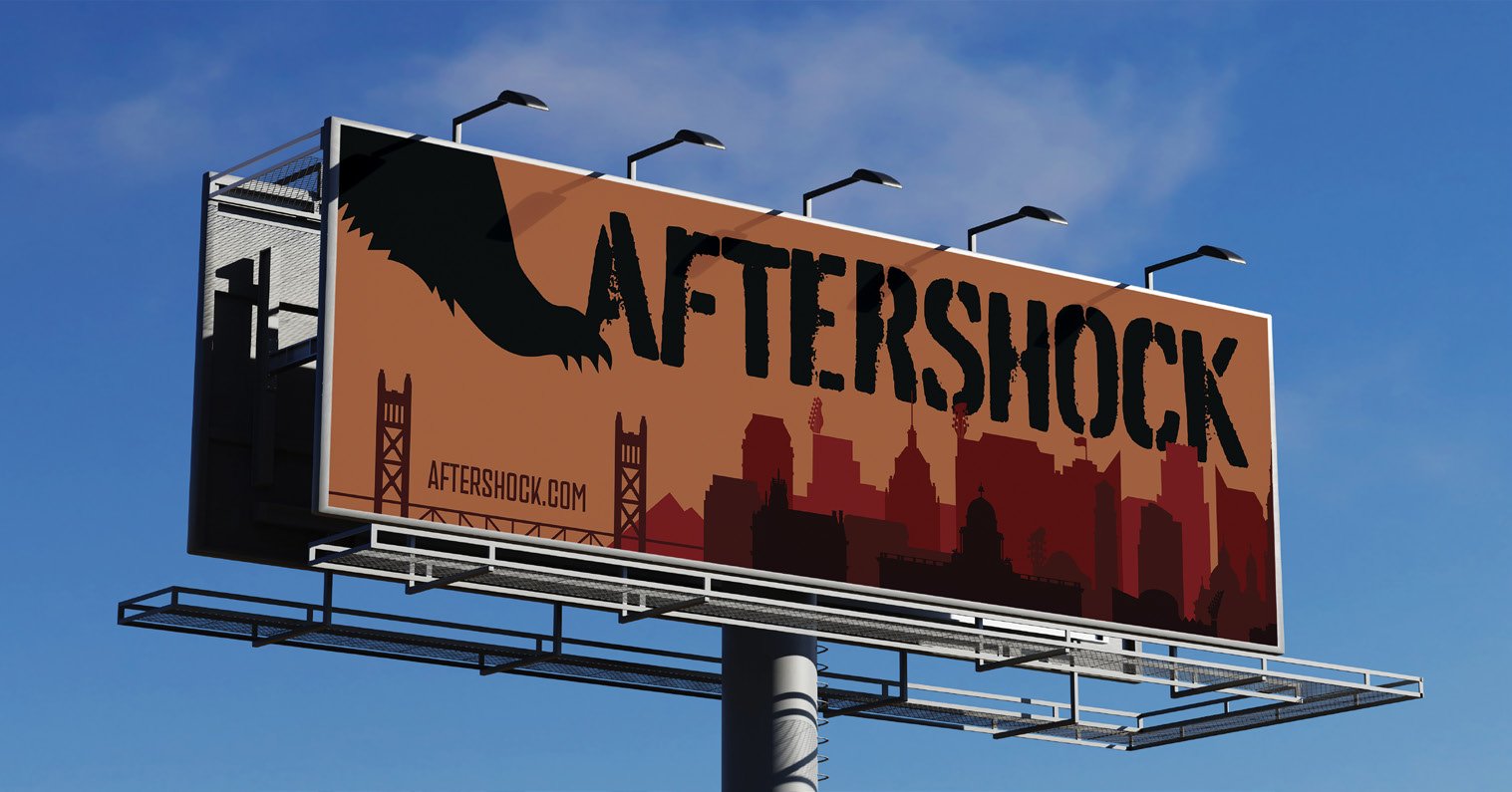
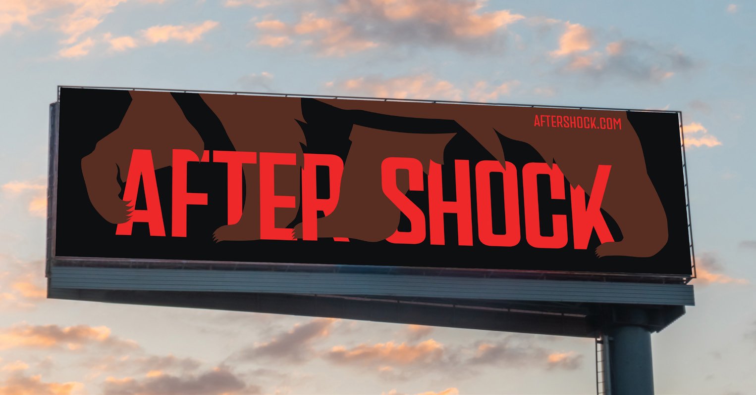
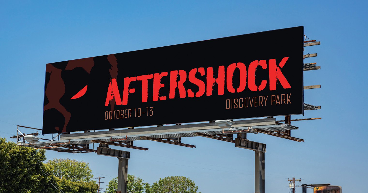
Red was the prominent color in my mood boards. Adding black portrayed the dark color scheme I wanted. California is known as the golden state, so including a yellow color would represent the state the festival is located in. Adding a brown color completed an analogous palette and also represents the environment of Discovery Park from the dirt on the ground to tree bark. The colors chosen bring the darkness I wanted but also tie in contrast with the lighter yellow and brown. I branded Aftershock as dark and intimidating so it was fitting to represent it with a bold and grungey typeface. A stencil typeface is common in rock and punk designs and showed the grit that I wanted to convey across my system. Rock and metal music are the opposite of clean and composed, it’s unpredictable and rough around the edges.
Schematic Design


Awareness
One of the best ways to create anticipation for Aftershock was by creating rounds posters that will be displayed in public that are visually powerful enough to catch people’s attention so that they want to find out more information about the festival. Once they are interested, they would consider the idea of going and how they’d get there. In order to come up with a diverse series of posters, I referred to my traids and moodboards to create groups of sketches that catered to each triad. Going through the three rounds of sketches got all of my ideas out of my head and onto paper to create imagery that contained meaning and paired well with my intended message to move onto the digital phase.
The three posters would rotate over time starting from left to right as the festival date got closer. The perspective goes from watching the aftermath of a bear destroying a guitar, watching angry bears look over the city of Sacramento, to being face-to-face with an enormous and scary bear.


The set of billboard advertisements rotate in order as the event date gets closer. The first billboard goes from the furthest view from the Sacramento cityscape with the bear slightly joining the frame to slowly gain anticipation. The second billboard teases that the bear and the event is getting closer, with its legs walking through the festival name. The last billboard shows the viewer being face-to-face with the bear in the closest view.
Planning
The potential customer is interested in attending Aftershock. They visit the website to get more information about the lineup and VIP options. They decide to upgrade to VIP and purchase tickets for themselves and a friend after learning about the benefits.
Clicking on the advertisements leads them to a landing page. Landing pages are not the same as websites, they are standalone web pages that guide visitors toward a call to action such as signing up for news and offers to buying a product. Sticking to one call to action avoids overwhelming audiences into making choices because their choice is limited and right in front of them. My landing page focuses on capturing audiences by informing them of the benefits of upgrading their tickets to VIP passes. This reminds audiences about their options and is an effort to convince them to still commit to going.


Waiting
Upon purchase of a VIP ticket, the customer receives a VIP package in the mail. They receive a goodie box with their VIP lanyard, a official VIP invitation, a pack of custom guitar picks, and a custom CD featuring all the bands on the lineup to listen to so they can prepare and gain anticipation for the event. The contact still needs to continue even after the purchase to encourage positive reviews and prepare them for the retention stage.


Experience
The day is here and they are at the venue. They get to experience the festival grounds from the 4 diverse stages, photo opportunities, to local vendors. As part of their VIP perks, they get to park in a separate lot, enter from an exclusive entrance, and get special access to the VIP lounge where some of the artists will visit and meet with fans.


